rodin café
Auguste Rodin is the inspiration of this New Orleans based cafe. This is a branding assignment that was given with three different options for imagery; an artist, an author or a scientist. I chose Rodin for his connection to symbolism and the fact that he has work on display in the New Orleans Museum of Art.
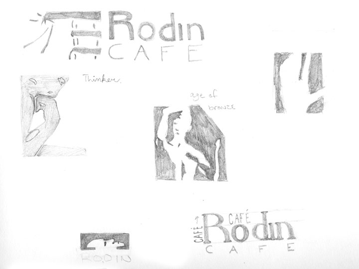
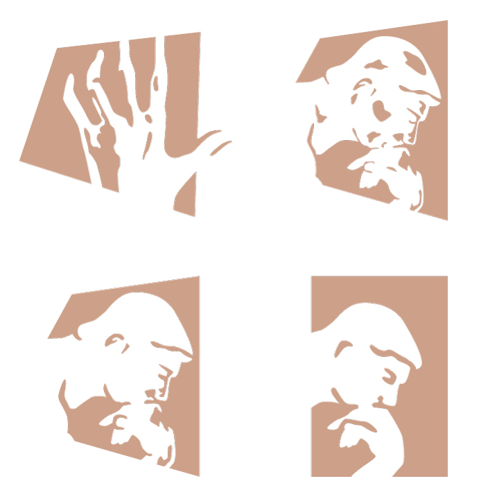
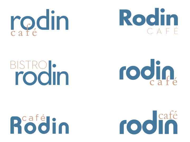
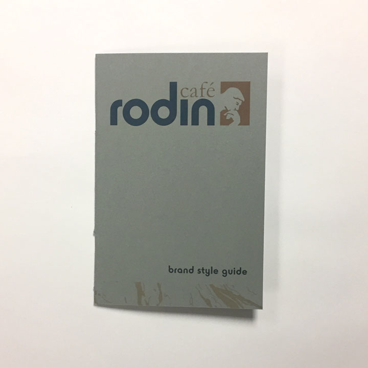
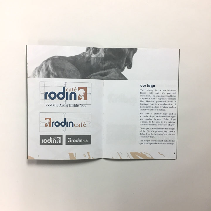
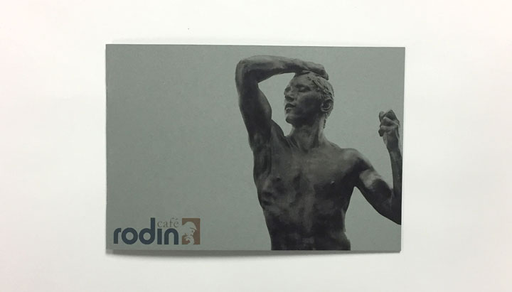
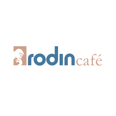
I began the logo with sketches of Rodin's hand sculptures, but was met with a bit of confusion. So, I started to develop the logo from The Thinker, definitely his most famous sculpture. The logotype extends itself from a very dependable and classic font with Garamond and a font that has more of an expressive attitude with Horatio Sans
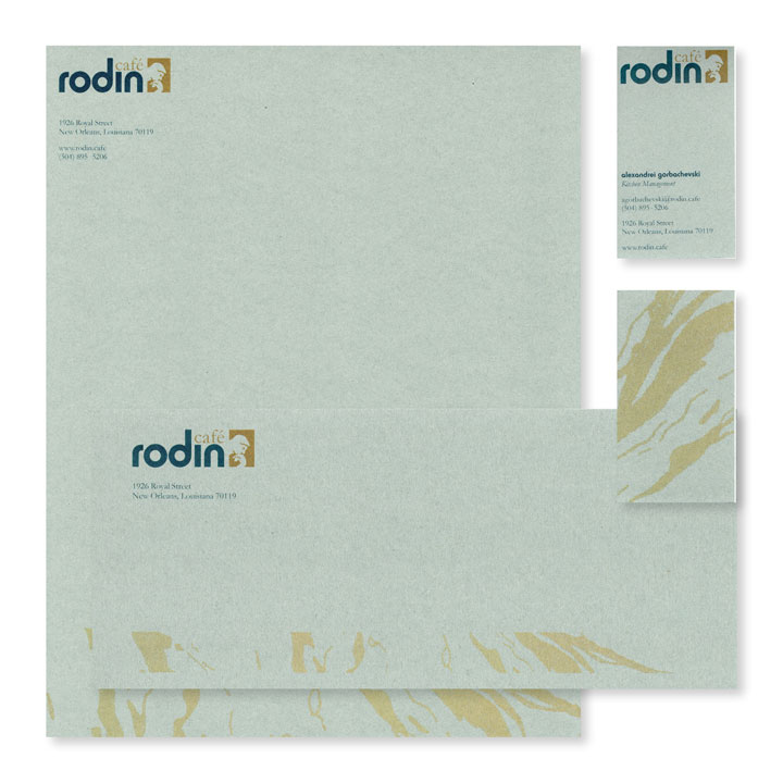
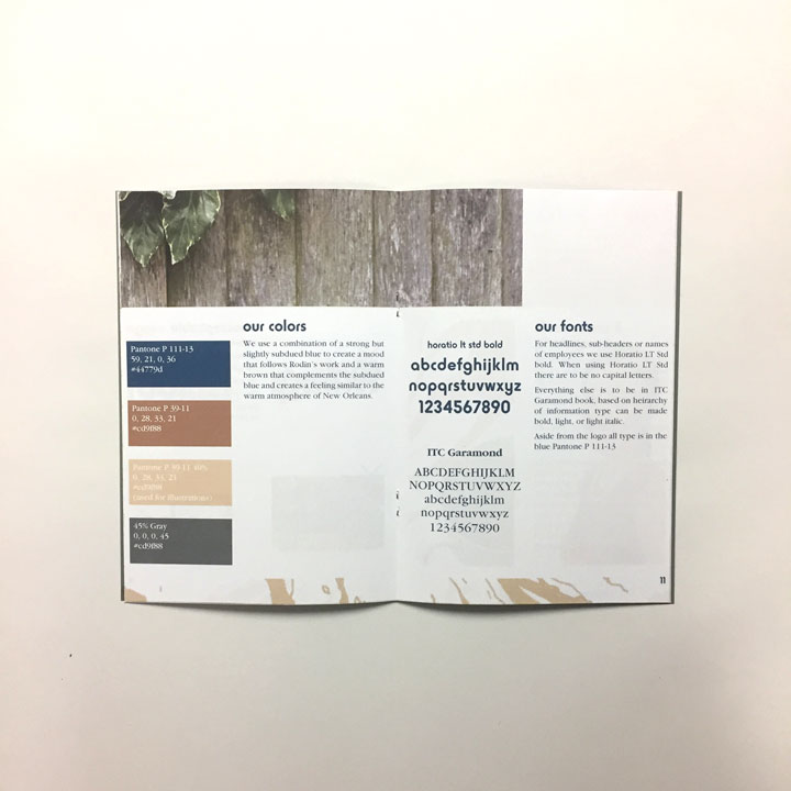
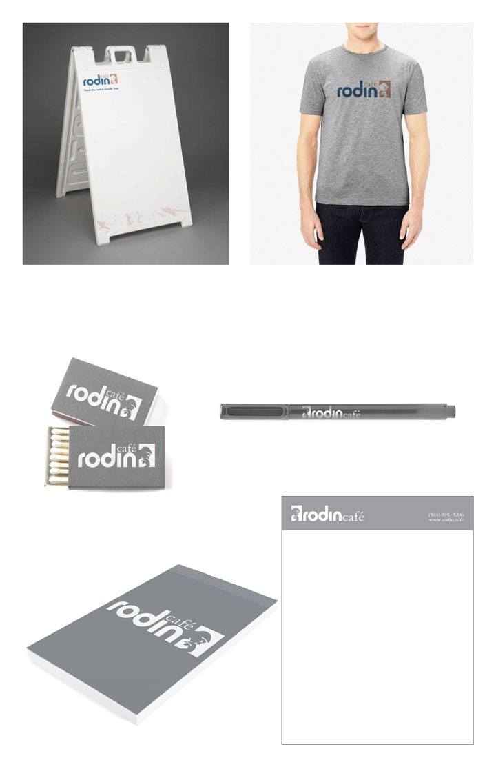
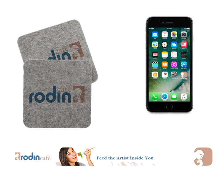
From the logo I needed a system to carry through the brand itself. The two primary colors, blue and the orangish brown color, represent the sculptor and the city. The blue is a very contemplative color as a play off the sculptures Rodin creates, they evoke a ton of emotion. The orangish brown is warm like the inviting atmosphere and climate of New Orleans.
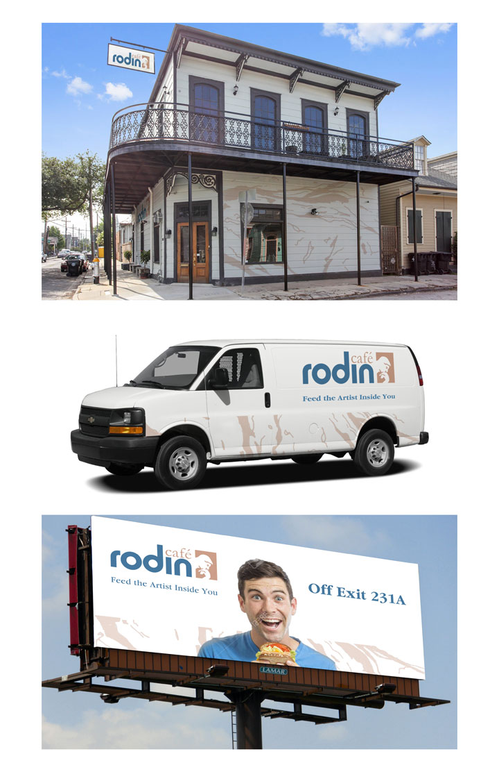
White and grey are the secondary portion of the palette. White for materials that are invitational, the outside of the cafe, the van and billboard, etc. It is a less confronting color that is attractive and open. However on the inside of the restaurant the materials are on grey, it is deeper, more contemplative. Grey is calming, this is the experience of Rodin's sculpture and also Rodin Cafe.
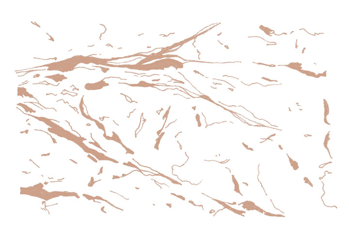
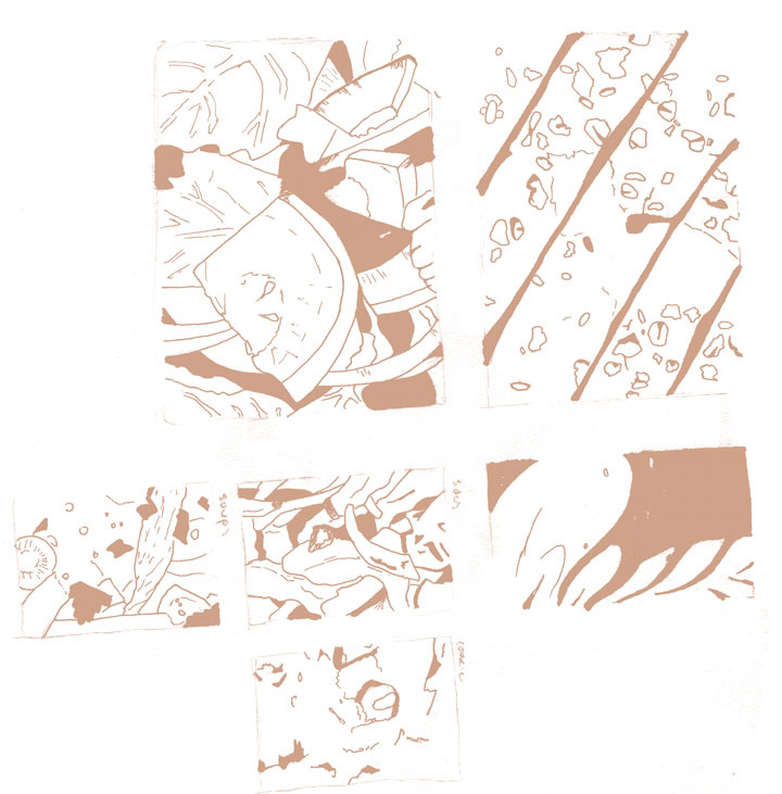
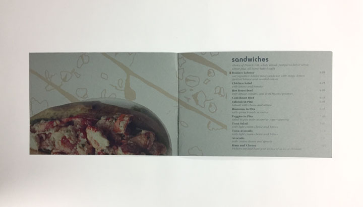
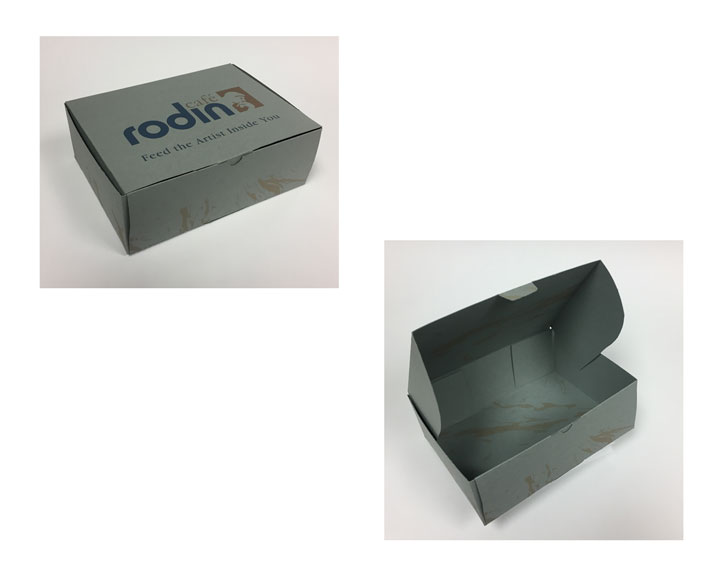
I created an illustration that is used as texture on most of the materials as a thin band or a field. The primary texture is derived from a classic sculpting material, marble, but is used to add interest to the designs. In the menu a different texture can be seen, close up illustrations of the page that is connected with them. The background of the page with sandwiches is the tops of a sliced loaf of bread. This is an important part of the brand of Rodin Cafe, the sort of piece de resistance.